Branding
YV Biotech Brand Identity
A modern, nature-inspired logo for an agricultural biotechnology company built on growth, sustainability, and technology.
- Client
- YV Biotech
- Role
- Brand Designer
- Year
- 2024
- Timeline
- May - Jun 2024
YV Biotech is a forward-thinking player in the agricultural biotechnology sector, dedicated to pioneering sustainable farming solutions through advanced technology. The objective of this corporate design project was to engineer a modern, high-impact brand mark that seamlessly bridges the gap between biological growth, ecology, and technology.
- Role: Lead Brand Designer & Visual Strategist
- Timeline: 2 Weeks
- Deliverables: Corporate Logo Architecture, Color Strategy, Brand Typography Guide
The Challenge
The Branding Challenge
In the fast-evolving agricultural biotechnology market, companies often struggle to find a visual equilibrium. Their branding either leans too heavily into cold, clinical tech forms or slips into overly traditional, generic farming tropes. YV Biotech needed a commanding corporate mark that felt deeply rooted in nature yet undeniably advanced, professional, and trustworthy to B2B investors and farming cooperatives alike.
The Design Concept: Geometric Synergy
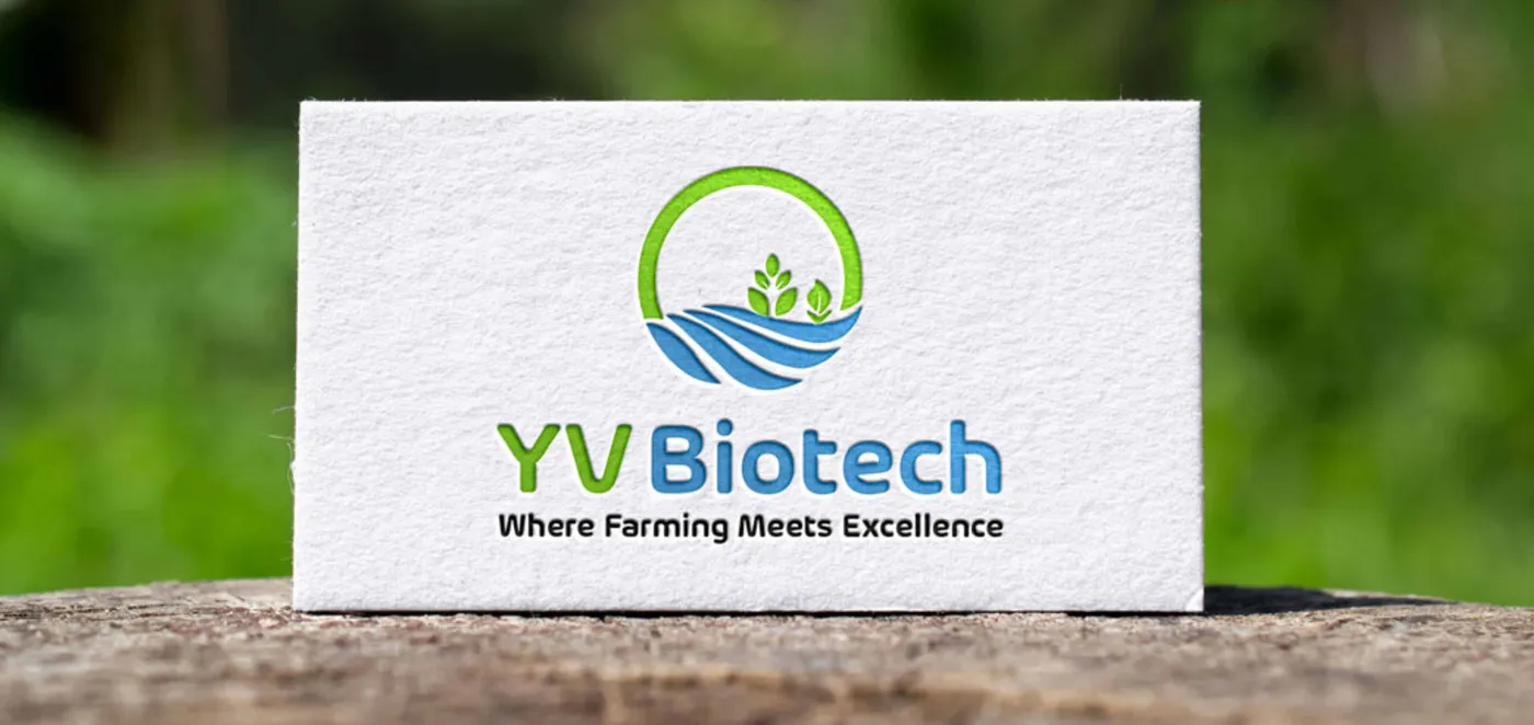
To achieve this, the logo was built using a multi-layered symbolic framework where every geometric form serves a distinct narrative purpose:
- The Green Circular Frame: Functions as a symbol for a holistic ecosystem, global sustainability, and continuous circular growth.
- The Central Plant Icon: A sharp, stylized representation of organic crops, symbolizing biotechnology, vitality, and agricultural advancement.
- The Wave & Field Motif: A dual-purpose geometric curve nested at the base, representing both fluid water resources and structured farmlands. This emphasizes the company's commitment to eco-friendly, resource-smart solutions.
Color Psychology & Typography System
The design system uses a precise palette and structural typography to ensure maximum visibility across digital platforms, research lab equipment, and physical product packaging.
| Asset | Code / Style | Strategic Design Role |
|---|---|---|
| Growth Green | #73B222 | Represents eco-conscious technology, organic growth, sustainability, and a fresh perspective on farming. |
| Trust Blue | #4188B8 | Infuses the brand with scientific reliability, data-driven technology, and industry trust. |
| Corporate Font | Arlon SemiBold | A clean, professional geometric typeface that gives the company name a highly stable, authoritative, yet modern and approachable presence. |
Outcomes & Portfolio Reflection
The resulting visual identity successfully establishes YV Biotech as a professional leader in the agritech sector. The mark operates beautifully as a high-contrast corporate header, scales cleanly onto small digital touchpoints, and maintains its structural integrity when rendered on manufacturing and product packaging. By combining natural motifs with precise geometric lines, the design demonstrates that sustainability and technology can co-exist under a unified visual system.

Next Project