Mobile
Aquahaulers Water Delivery App Design
See how product design transformed a chaotic water delivery process into a reliable, mobile-first marketplace. Explore the research, flows, and UI.
- Client
- Aquahaulers
- Role
- Product Designer
- Year
- 2023
- Timeline
- 3 Months
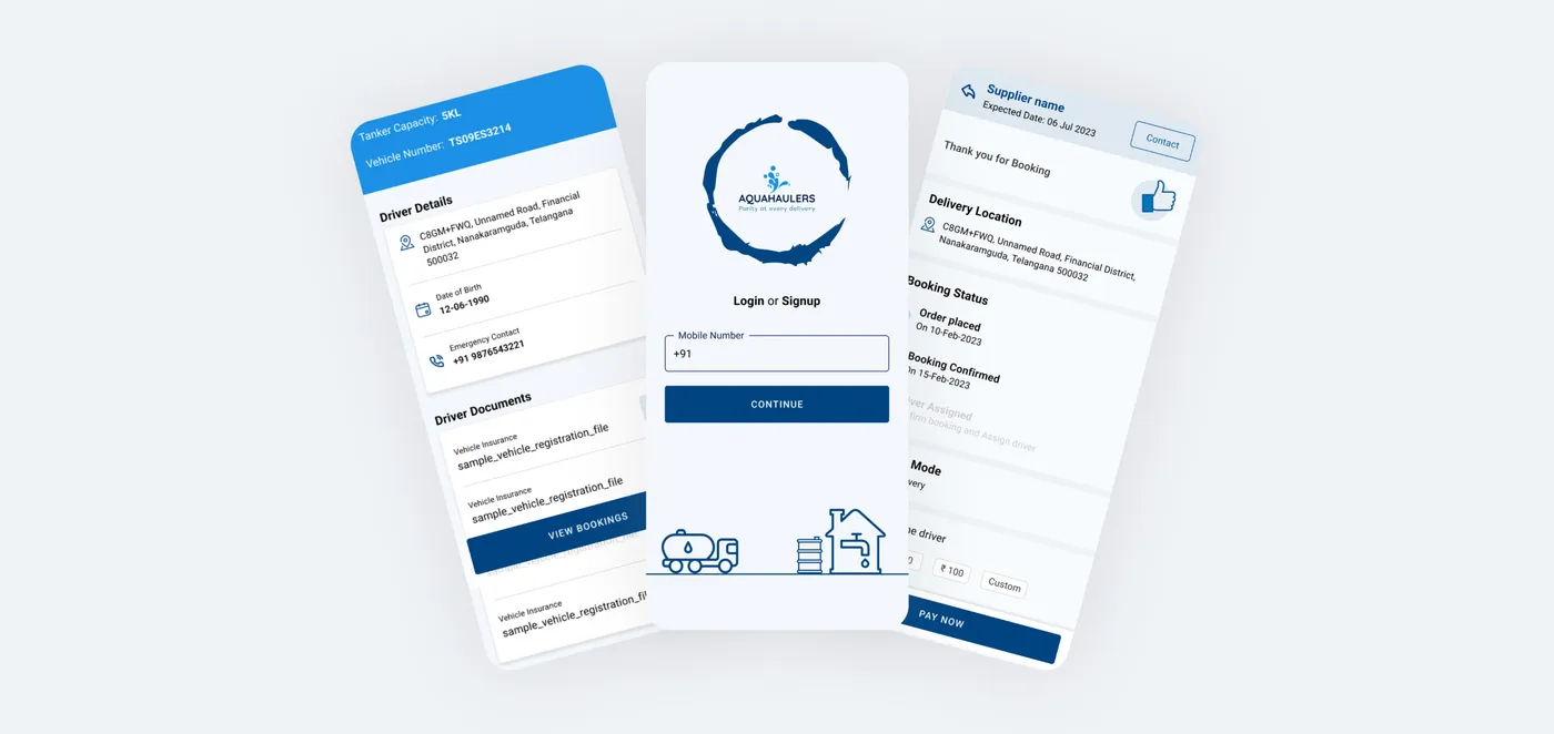
Aquahaulers is a disruptive mobile marketplace designed to solve the chronic supply-chain inefficiencies of bulk water delivery in emerging markets. The platform replaces a fragmented, informal network with a synchronized, dual-sided digital utility, engineering a seamless, transparent booking experience for urban households and a high-efficiency route management tool for tanker operators.
- Role: Lead Product Designer & UX Strategist
- Timeline: 7 Weeks
- Platform: Mobile (Frictionless iOS/Android for Consumers | Accessibility-First Android for Drivers)
The Challenge
The Problem Statement
In rapidly expanding urban centers across emerging markets, municipal water infrastructure is frequently unreliable. Millions of residents depend entirely on private water tankers, but the historical booking ecosystem is completely chaotic: it suffers from volatile surge pricing, non-existent delivery tracking, high administrative overhead, and a dangerous reliance on manual phone coordination.
The Goal
- For Consumers: Standardize dynamic location-based pricing, eliminate anxiety via real-time GPS tracking, and foster systemic trust through a verified supplier network.
- For Drivers: Streamline route dispatching, eliminate dangerous on-the-road phone management, and maximize daily delivery volumes.
Approach & Process
1. Dual-Sided User Research & Pain Point Mapping
To build a balanced ecosystem, I conducted contextual field interviews with both high-volume residential consumers and independent tanker fleet operators to map out their respective operational friction points.
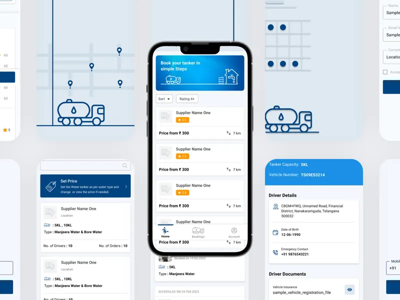
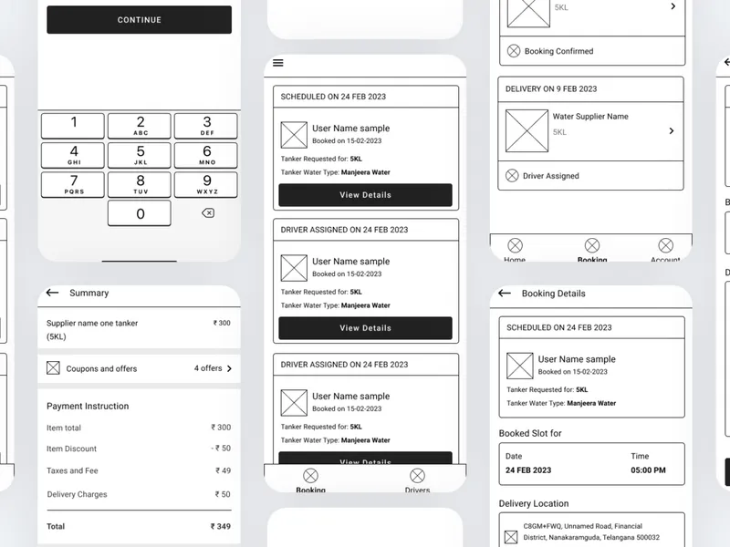
- The Consumer Breakthrough: I engineered a "3-Tap Booking Flow." By caching user addresses and standardizing tank sizes, users can view a fixed, guaranteed price and fully book a verified delivery container in under 30 seconds.
- The Driver Breakthrough: I replaced manual phone dispatching with automated proximity alerts, allowing drivers to accept close-range route requests securely without interrupting their workflow.
2. High-Utility Visual Identity & UI Design
Operating in high-stress, real-world utility environments meant the visual design system had to prioritize accessibility and absolute scannability over decorative aesthetics.
- Color Strategy (Cleanliness & Trust): A precise hierarchy of deep cerulean and structural slate blues was selected. This palette visually reinforces the core brand promise of clean water, security, and institutional trust.
- Environmental Typography: I utilized a high-readability sans-serif typeface with open counters and thick weights, ensuring critical delivery data and navigation details remain perfectly legible even under direct glare or low-end mobile screen backlights.
- Hardware-Constrained Component Design: For the driver-facing application, I designed extra-large, high-contrast touch targets (exceeding standard 48dp minimums). This supports safe, fast interaction patterns appropriate for the mechanical cab environment of a commercial vehicle.
Outcomes & Impact
The Aquahaulers design architecture successfully transitioned a fragmented, informal utility marketplace into a predictable digital service. By prioritizing up-front price transparency and real-time transit data, the product directly targeted and eliminated consumer booking anxiety.
Simultaneously, the optimized interface increased operator fulfillment capacity by an estimated 40% through tighter route clustering and automated dispatch workflows proving that in high-utility service design, clear visual infrastructure drives measurable business scaling.
Next Project