Mobile App Design
Collaborative Memory Sharing App
After a group trip the photos scatter across four apps and one person gets stuck compiling them. A self-initiated concept for the version where nobody has to.
- Client
- Internal Project
- Role
- Product Designer
- Year
- 2024
- Timeline
- 6 Weeks
Overview
Everyone has been the person compiling the photos after a trip. The group comes home, the pictures sit on six phones at six different resolutions, and someone volunteers to put something together. Usually it takes a fortnight. Often it never happens.
This is a concept for the version where nobody has to. Everyone at the event contributes to one shared stream as it happens, and the app assembles the highlights itself.
It was self-initiated six weeks of product design, no client, nothing built. I have included it because it is the clean case: one user, no permission model, no hardware, no legacy system to work around. When a product has a single clear user and no structural complication, six weeks is roughly what the design takes, and this is what that looks like.
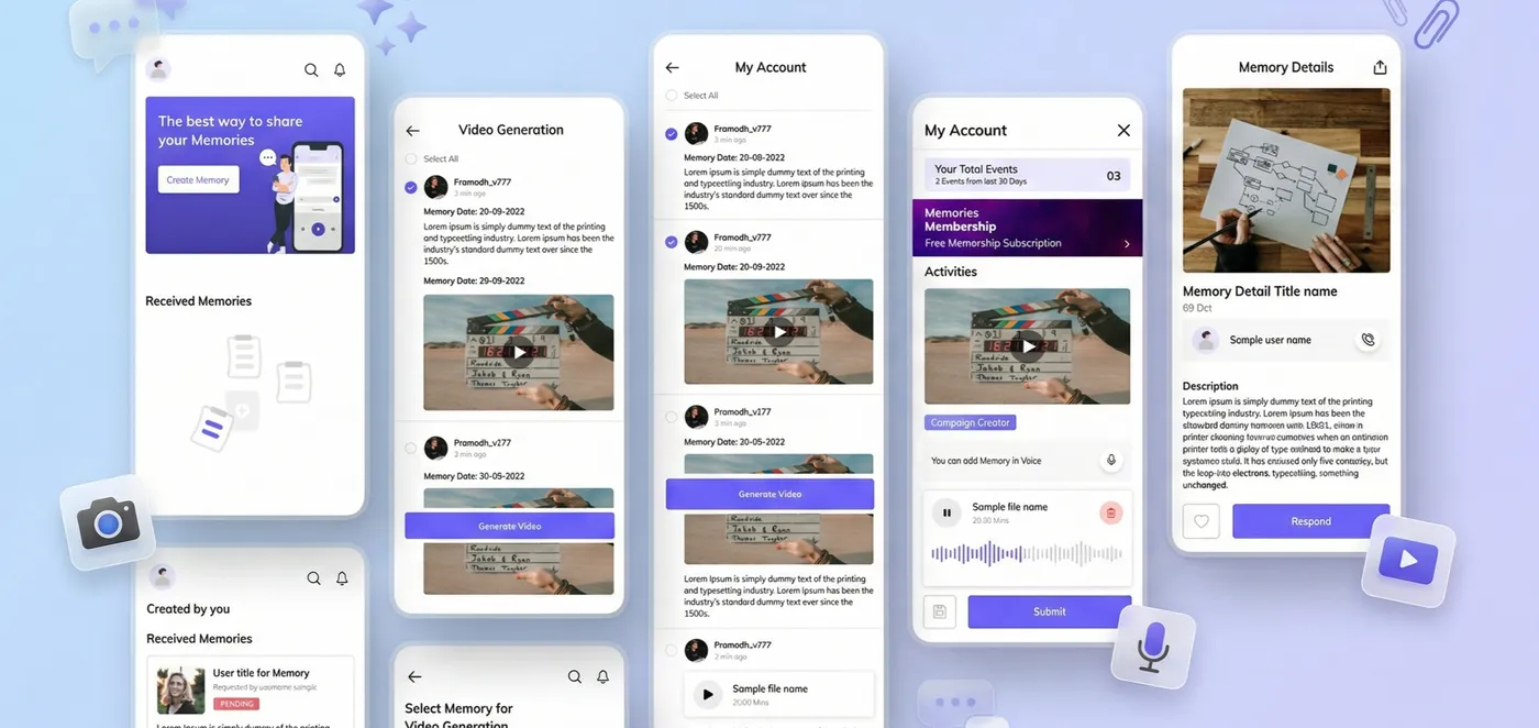
Join by pointing a camera
A QR code at the event. No account setup standing in a doorway.
Contribute without deciding to
Media syncs in the background at full resolution, so nobody is curating at the time.
The montage assembles itself
Clustering by time, place and reaction produces a highlight reel without a volunteer editor.
One place instead of four
Replaces the WhatsApp, Instagram, iCloud and drive-link routine that loses quality at every step.
The Challenge
Current tools treat shared memories as file storage. The photos survive; the occasion does not.
The real failure is not technical. It is that the work of turning an event into something worth revisiting falls on one person, after the fact, when everyone has gone home and the momentum is gone. That person is doing unpaid editorial labour, and the reason group albums die is that they quietly stop being willing to.
What goes wrong at the event
- Everyone shoots the same three moments and nobody shoots the rest.
- Sharing means interrupting the thing you are sharing to share it.
- Media goes out over chat apps that recompress it, so the archive copy is the worst copy.
What goes wrong afterwards
- Photos live on six phones and nobody has the full set.
- One person becomes the editor by default, and the job is bigger than it looked.
- Momentum dies within about a week, and after that nothing gets made at all.
Users & Research
I audited how people actually share media after group events the sequence of apps, where quality is lost, and where the process stalls. The finding that mattered was about timing, not tooling.
- The window is about a week. Interest in assembling something decays fast. Anything that requires a decision later than that is designing for a moment that has passed.
- Capturing and sharing compete. Every act of sharing during an event takes the person out of it. Background upload is not a convenience feature here; it is the whole premise.
- People do not want to curate; they want to have curated. The desired end state is a finished thing. The work in between is what they are avoiding.
- Nobody trusts an automatic edit they cannot correct. An algorithmic montage that cannot be adjusted gets abandoned the first time it picks the wrong photo.
| WHO | WHAT THEY WANT | WHAT THE DESIGN OWES THEM |
|---|---|---|
| The participant | To be present at the event and still end up with the photos. | Contribution that costs nothing at the time. Join once, then forget the app exists. |
| The reluctant organiser | To not be the editor again. | A finished montage they did not have to make, and the ability to fix it when it is wrong. |
Journey & Architecture
The shape of the problem is a curve: attention is high during the event and gone a week later. The product has to do its work inside that window.

The architecture is deliberately shallow. One event hub, and everything else hangs off it.
The event is the top-level object
Not the user, not a feed. You open the app to a specific occasion, because that is how people remember.
No global timeline
A merged feed of every event flattens things that are not comparable. A weekend away and a birthday dinner do not belong in one scroll.
The reel is a destination, not an export
The generated montage lives inside the event and updates as media arrives, rather than being produced once and shipped elsewhere.
Flows & Key Decisions
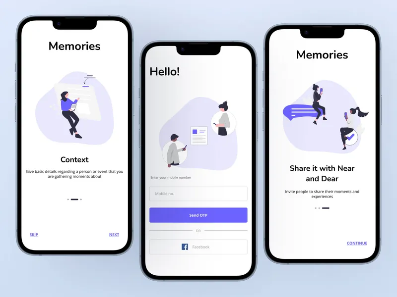
Joining — "do this in a doorway"
- A scannable code, because typing a join link while holding a drink does not happen.
- Contribution before registration; an account is only required to take media away.
- One permission request, at the moment it is obviously needed, not on first launch.
Background sync — "contribute by forgetting"
- Full-resolution upload in the background, so the archive copy is the good copy.
- Uploads resume rather than restart, and wait for wifi by default.
- No upload progress in the primary interface. Watching a progress bar is participation in the wrong thing.
The automatic edit — "and when it is wrong"
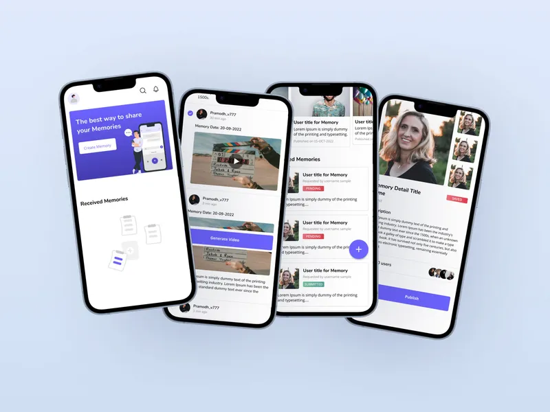
- Clustering by time, location and reaction produces a draft, not a final cut.
- Every generated reel is editable: reorder, exclude, change length.
- The app never silently drops someone's contribution. If a photo is not in the reel it is still in the event.
Leaving the moment alone
- No notifications during the event window. The product's whole argument is that it does not interrupt.
- The reel notification fires afterwards, when there is something finished to look at.
- Reactions are lightweight and do not open a conversation thread.
Design System & UI
The media is the content. Everything the interface does is get out of its way.
Midnight indigo, not black
A deep indigo ground makes photographs read as vivid without the interface competing. Pure black flattens the edges of dark images against the page.
Frosted overlays, for a reason
Navigation sits over full-bleed media. A translucent layer keeps controls legible while leaving the photograph visible underneath, which a solid bar does not.
Spring motion, not easing curves
Transitions are spring-based so movement feels physical rather than timed. Turning pages in an album has weight, and the interface borrows it.
Chrome that recedes
Controls fade during playback and return on touch. On a screen whose only job is showing a photograph, persistent chrome is a design failure.
What I Did Not Test
No user testing was run against this. It is a self-initiated concept that ended at a prototype, and the sensible thing is to say so rather than describe imaginary findings.
The audit of how people currently share media was real. Everything downstream of it is reasoned, not validated. The claim most likely to be wrong is the central one: that an automatically generated montage is good enough that people prefer it to no montage at all. That is an assumption the whole product rests on, and it is not the kind of thing an interface review can settle.
The second thing I would test is the join flow in a real doorway, at an actual event, with someone holding a drink. Everything about it is designed for that moment and none of it has met one.
Iterations
- The shared album became an automatic edit. The first version was a better album, which is the obvious product and the wrong one. It still needed a volunteer to arrange things. Removing the editor was the change that made the concept worth designing.
- The global feed was cut. An early architecture merged every event into one timeline. It made the app look like a social network and made individual occasions harder to find, which is the opposite of the point.
- Upload progress left the main screen. Showing sync status prominently turned a background process into something to supervise. It moved to a quiet indicator, because the design argument is that contributing should cost no attention.
Final Experience

Impact / Outcomes
A self-initiated concept that ended at a prototype. There are no adoption numbers, no testing results and no launch, and inventing any of them would be worse than the empty column.
| DESIGNED | Contribution that costs nothing at the time. QR join, one permission request, full-resolution background sync, and no progress bar demanding supervision. |
| DESIGNED | The editor removed. Clustering by time, location and reaction produces a draft reel with no volunteer required and every draft is correctable. |
| DESIGNED | One place instead of four. The event hub replaces the chat-app-to-cloud-to-social routine that loses quality at every hop. |
| UNTESTED | Whether the automatic edit is good enough. The premise of the entire product, and exactly the thing a prototype cannot answer. It needs real events and real media. |
| OPEN | The clustering model itself. Specified as a design intent, not an algorithm. What counts as a moment worth including is a research problem I scoped and did not solve. |
| OPEN | Everything after the reel. Printing, long-term archiving and what happens to an event nobody opens again were deliberately left out of a six-week scope. |
My Contribution
Sole designer, six weeks, self-initiated.
Research & definition
The audit of how people share media after events, the decay-window finding, and the reframe from shared album to automatic edit.
IA & flows
The event-hub architecture, the join and background-sync flow, and the montage generation flow with its correction paths.
Design system & UI
Colour, type, elevation and motion tokens, the frosted overlay treatment, and the component set behind the screens.
Prototype
A clickable prototype at device size, used to test the concept's shape rather than to hand to a build team.
FAQ
Frequently asked questions
Was this built for a client?
No. It was self-initiated, six weeks of product design run as an internal project. Nothing shipped, and no outcomes here are measured.
Why include a concept project in a portfolio?
Because it is the clean case. One user, no permission model, no hardware, no client politics. It shows what the process looks like when nothing structural is complicating it, which makes it a useful comparison against the projects where something is.
How long does a project like this take?
Six weeks. When a product has a clear single user and no structural complication, that is roughly what product design takes. Add a second audience or a role model and it grows.
What is the hard problem in an app like this?
Not the interface. It is deciding what the automatic montage includes, because the app is choosing which moments count on someone's behalf and it will sometimes choose badly.
Next Project