Branding, Web
JK Group USA Brand Identity & Web Design
Explore how a premium brand identity system and responsive marketing website gave video production agency JK Group USA a bold, high-converting digital storefront.
- Client
- JK Group USA
- Role
- Brand & UI/UX Designer
- Year
- 2024
- Timeline
- Aug - Sep 2024
JK Group USA is a full-scale video production company specializing in high-end commercial visual storytelling. This project involved a comprehensive creative overhaul, encompassing the delivery of a new corporate brand identity and a high-performance marketing website designed to capture and convert corporate B2B leads.
- Role: Lead Brand Designer & UX/UI Strategist
- Timeline: 6 Weeks
- Deliverables: Brand Identity System, Cross-Medium Style Guide, Responsive Web Design
The Challenge
The Problem Statement
For a premium video production agency, the brand identity is the first proof of capability the moment a prospect lands on their site, the visual execution must immediately validate their storytelling authority. JK Group’s primary challenge was asset scalability: the new visual identity needed to feel incredibly cinematic and premium when displayed on a massive desktop website hero section, yet remain perfectly crisp, sharp, and recognizable when shrunk down to a video watermark overlay or printed on physical corporate stationery.
The Brief
To engineer a singular, unified design system and brand mark that performs flawlessly across both high-resolution digital screens and physical print mediums without losing its premium edge.
Approach & Process
1. Visual Identity & Logo Architecture
I anchored the discovery process in the agency’s core values: Creativity, Cinematic Excellence, and Professionalism.
- Competitive Research: I analyzed modern minimalist visual marks, movie-studio title cards, and legacy film-industry iconography to see how high-end production houses project authority.
- Sketching & Iteration: I explored various structural concepts, combining film reels, play buttons, and abstract geometric camera forms.
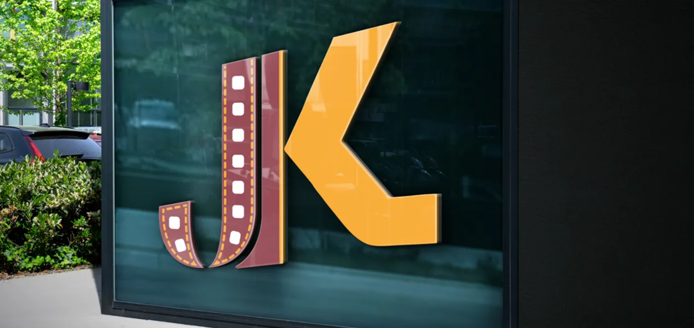
- The Breakthrough: The final mark seamlessly merges the letter "J" into a stylized film strip. This clever integration fuses the company’s name and their core craft into a single, memorable shape.
2. Strategic Color Palette
- Deep Maroon: Selected to evoke passion, intensity, and the emotional depth of cinematic storytelling.
- Warm Gold accents: Paired alongside the maroon to signal prestige, creative excellence, and premium production value.
3. High-Conversion UX Website Strategy
During the competitor discovery phase, I exposed a glaring UX flaw common among production agency sites: overly complex navigation layouts that buried the actual video work. To solve this, I designed a streamlined, presentation-first layout:
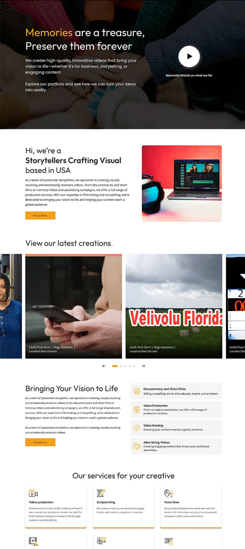
- Above-The-Fold Hook: The site opens with a bold, immersive cinematic video hero wrapper to capture immediate user attention.
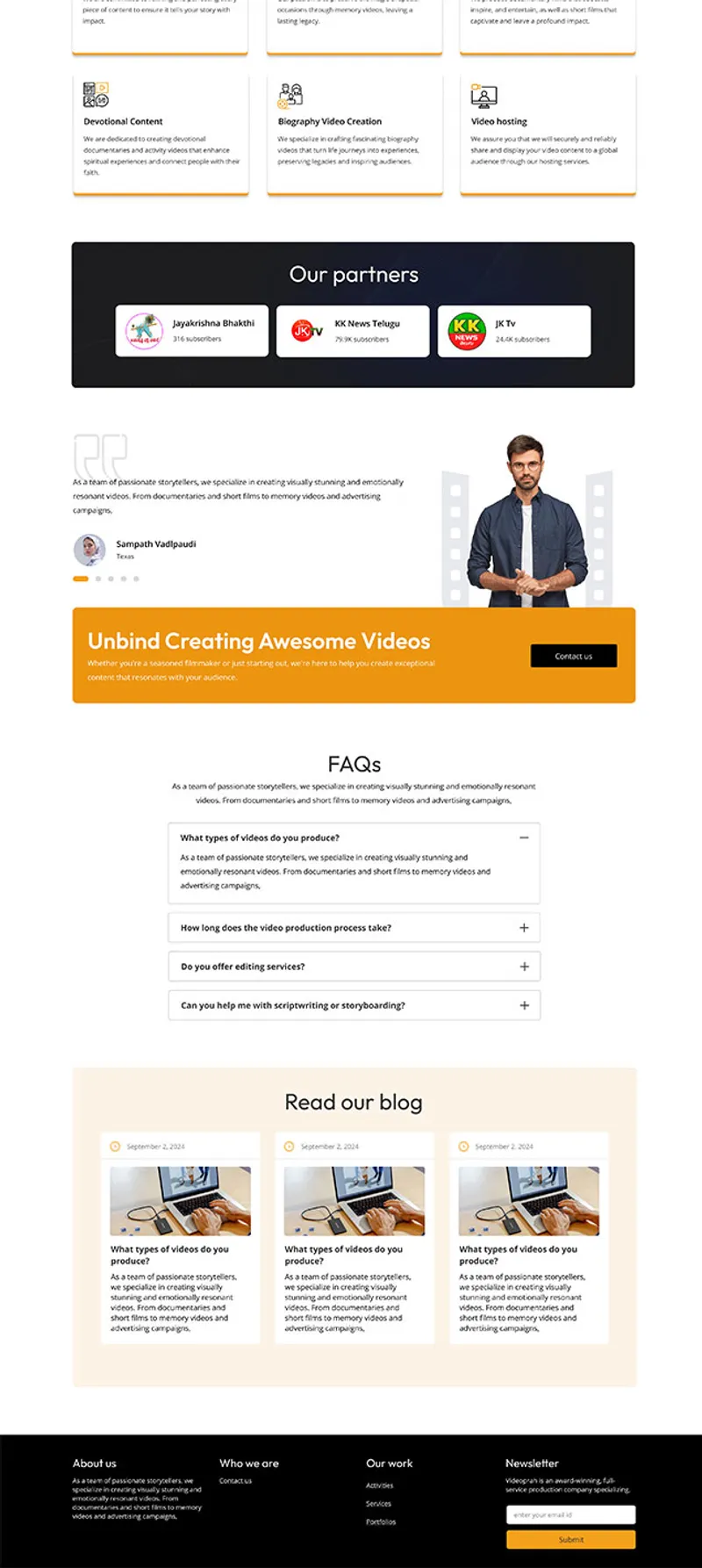
- Scannable Service Architecture: Services are broken down into intuitive, icon-driven categories, allowing corporate clients to instantly find the type of production they need (e.g., Commercial, Corporate, Documentary).
- Frictionless Conversion: Implemented a strategic user routing flow that funnels prospective clients straight to high-fidelity portfolio case studies with zero scroll fatigue, always terminating in an unmistakable Call-to-Action (CTA).
Outcomes & Business Value
The new logo instantly communicates elite cinematic storytelling at a single glance. Its vector architecture ensures flawless scalability rendering beautifully as a tiny, transparent digital video watermark, an embroidered shirt logo, or a crisp emblem on a business card.
The accompanying marketing website balances high-impact creative imagery with direct conversion copywriting and an interactive carousel of recent projects. The result gives JK Group USA a digital storefront that matches the premium quality of the films they produce.

Next Project